RE-LOVING THE BEAN
A COMPREHENSIVE EXHIBITION
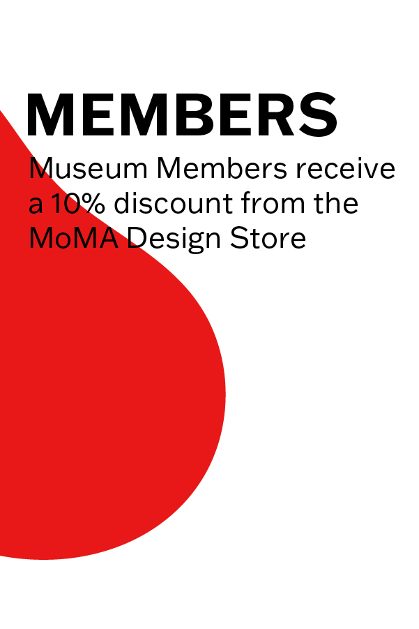
A typographic system and branding identity I created in my Typography III class for a jelly bean exhibition at the Museum of Modern Art, including advertising, admission tickets, and some merchandise. The red bean as a consistent graphic element is derived from the recognizable red bean in the Jelly Belly candy logo.A COMPREHENSIVE EXHIBITION

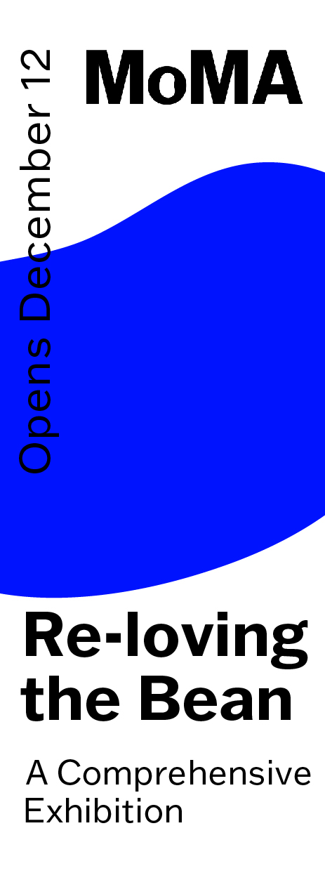
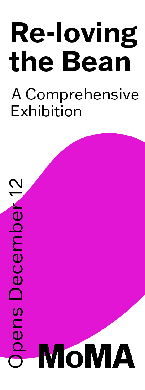
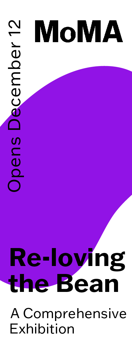
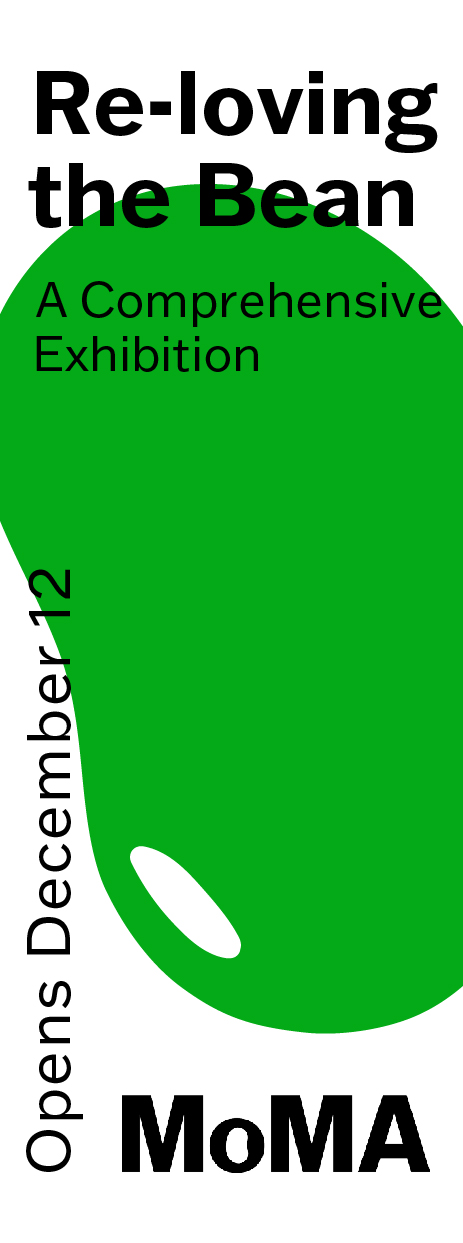
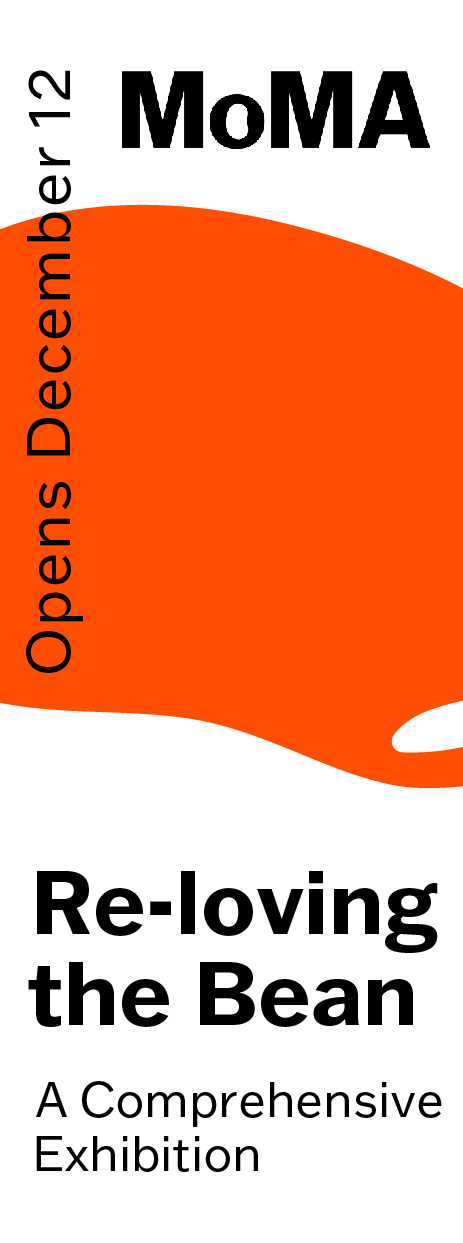
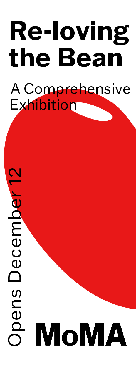


Posters for downtown
Dimensions: 24 x 36 in.
![]()
![]() Merchandise
Merchandise
Bean-ie hat & collectable beans
Dimensions: 24 x 36 in.
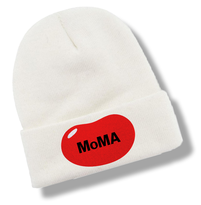
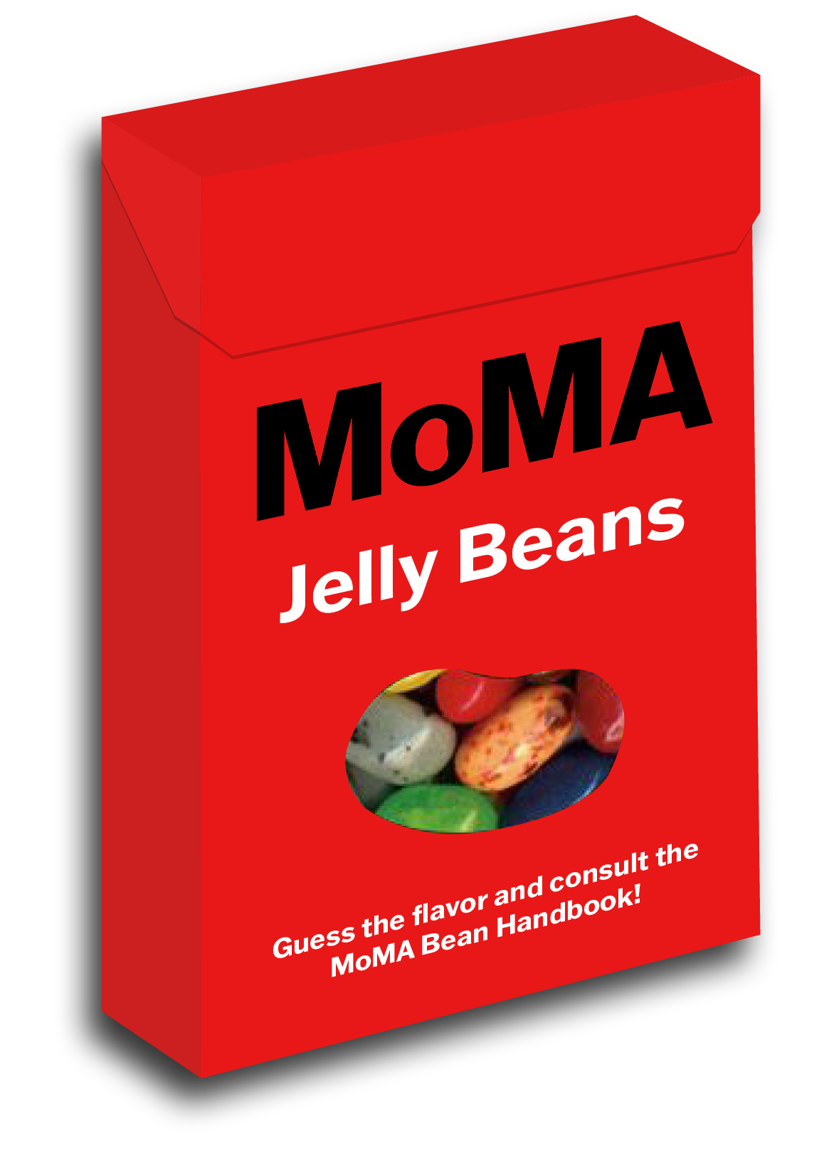
Bean-ie hat & collectable beans

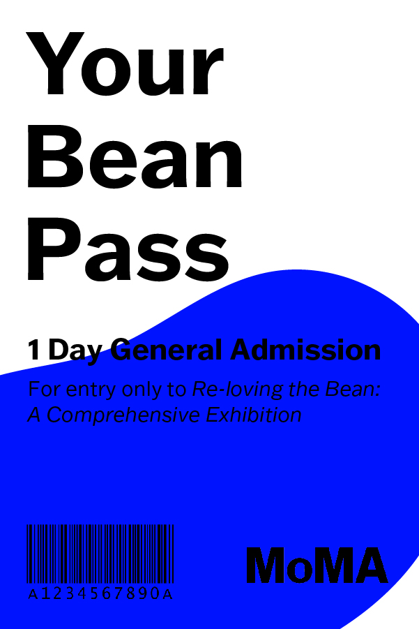
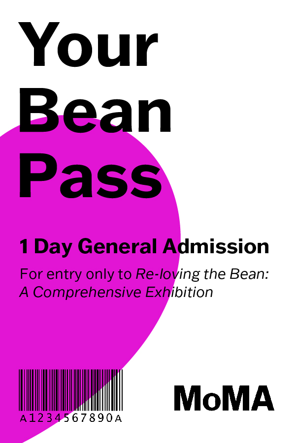
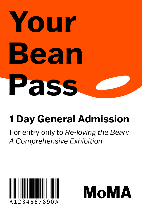

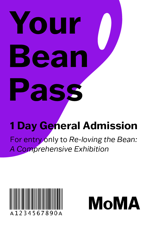
Admission tickets

Digital bus station ad
Process


