


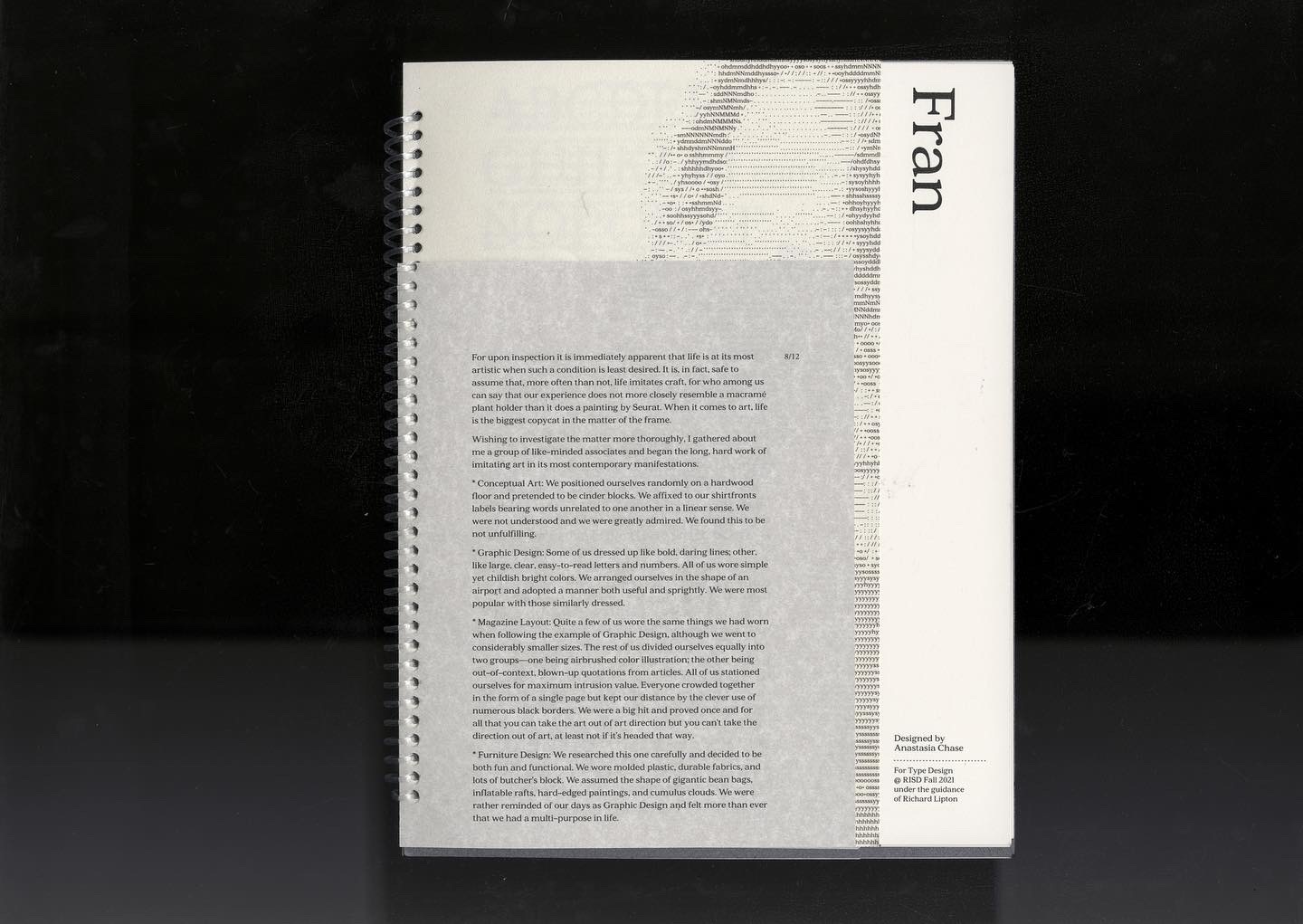
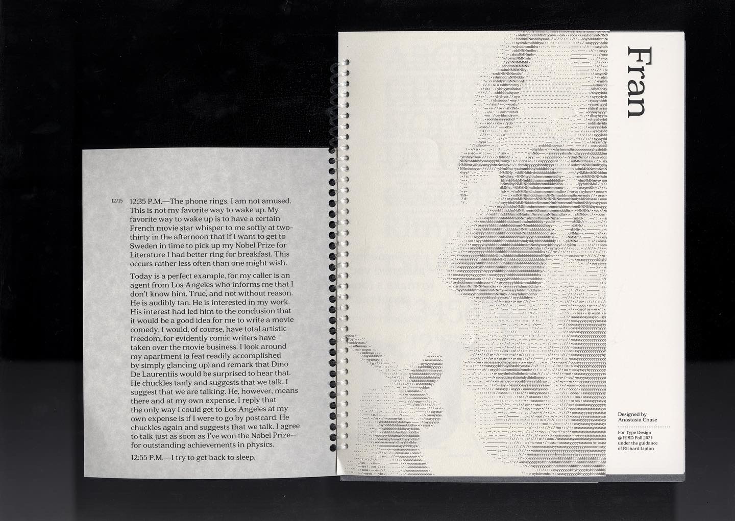
FRAN TYPEFACE
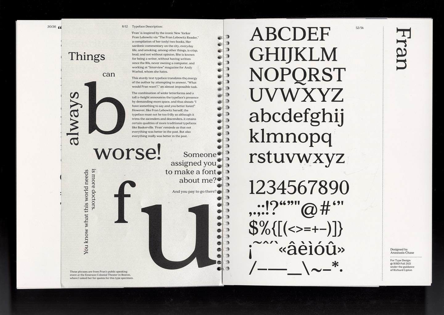
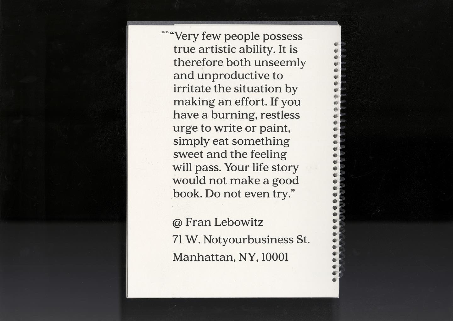
‘Fran’ is inspired by the iconic New Yorker Fran Lebowitz via The Fran Lebowitz Reader, a compilation of her (only) two books. Her sardonic commentary on the city, everyday life, and smoking, among other things, is crisp, loud, and not without opinion. She is known for being a writer, without having written since the 80s, never owning a computer, and working at Interview magazine for Andy Warhol, whom she hates.This sturdy text typeface translates the energy of the author by attempting to answer, “What would Fran want?,” an almost impossible task.
The combination of wider letterforms and a tall x-height announces the typeface’s presence by demanding more space, and thus shouts “I have something to say and you better listen!” However, like Fran Lebowitz herself, the typeface must not be too frilly so although it trims the ascenders and descenders, it retains certain qualities of more traditional typefaces like Baskerville. ‘Fran’ reminds us that not everything was better in the past. But also everything really was better in the past.
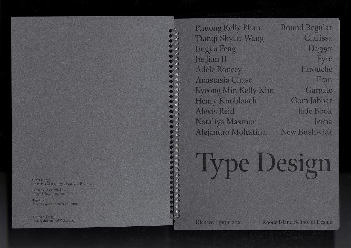
(I designed this typeface over the course of a semester for Richard Lipton’s Type Design class using RoboFont software. The images shown are from our class type specimen of which I scanned and is fully viewable here.)
Dimensions: 48p x 68p (8 x 10.5 in.)
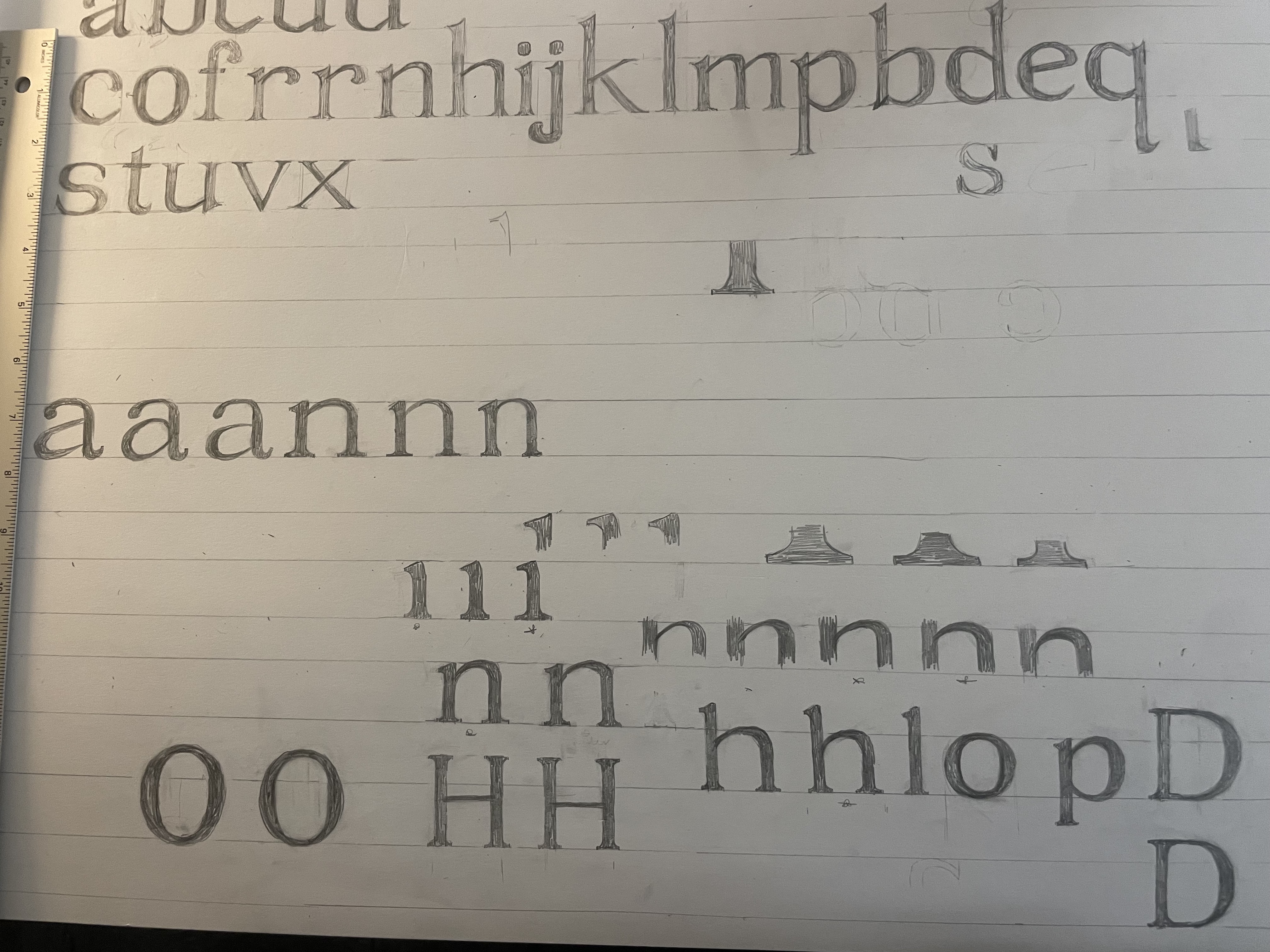
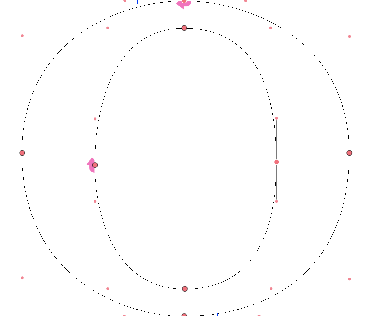
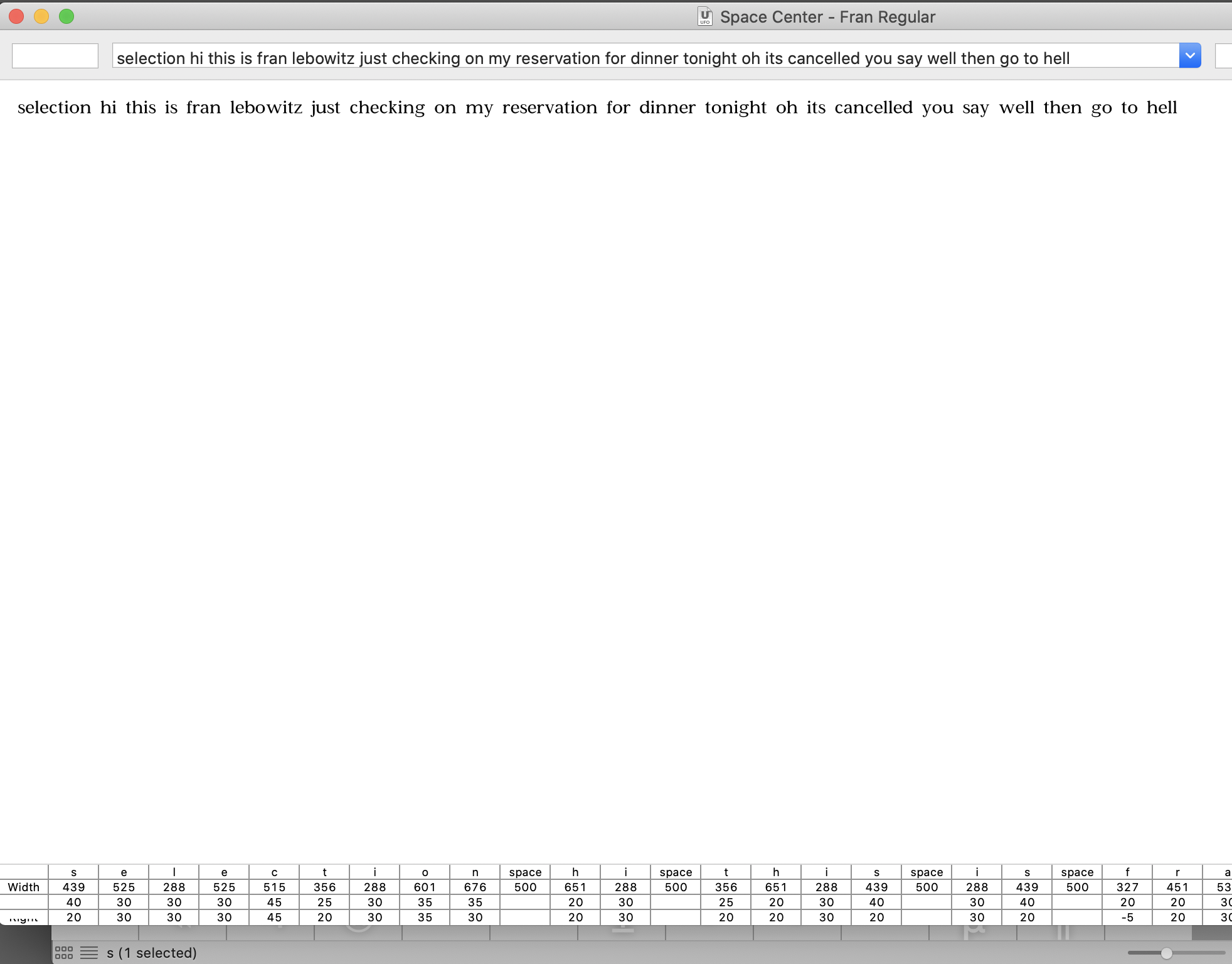
Some process